woensdag 28 september 2011

Room or house with a view. likes or dislikes?

Room Room by Takeshi Hosaka
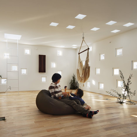
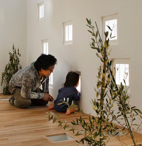
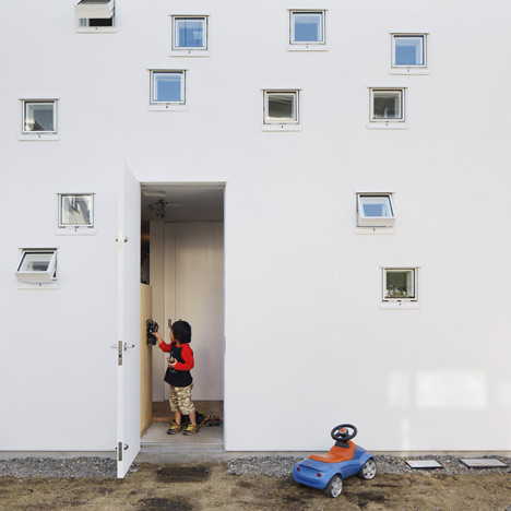
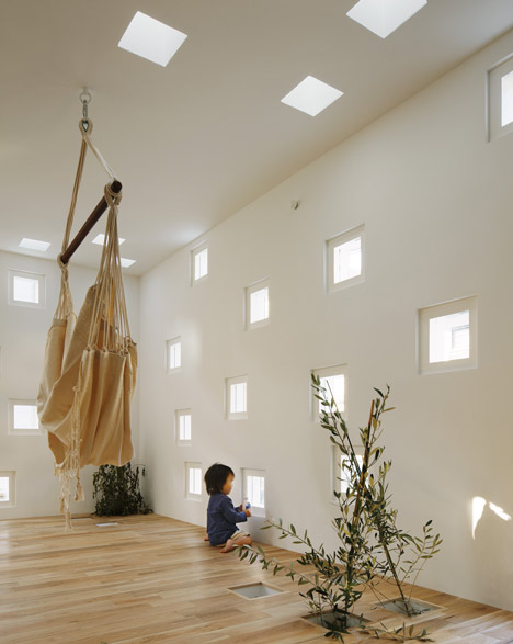
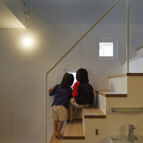
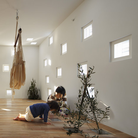
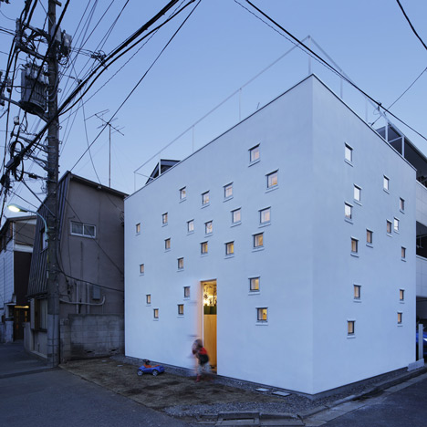
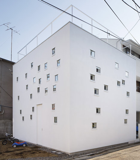
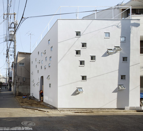
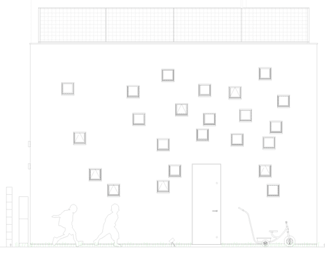
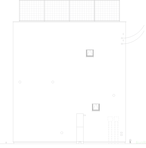
Almost a hundred small square windows scattered across the walls, ceilings and roof of a house in Tokyo allow its occupants, a deaf couple and their children, to sign to each other through the walls even when the children are playing outdoors.
Room Room by Takeshi Hosaka
The two-storey house by Japanese architect Takeshi Hosaka is named Room Room.
Room Room by Takeshi Hosaka
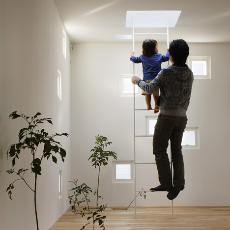
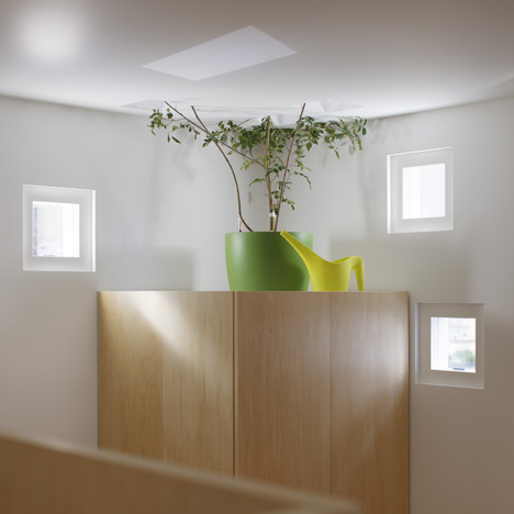
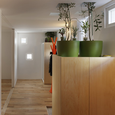
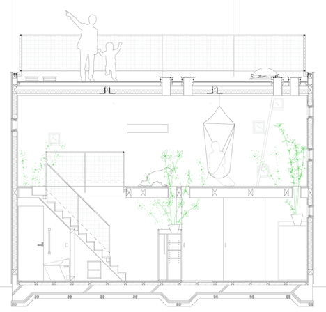
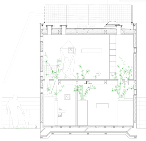
Ceramic pots resting on surfaces in the two ground floor rooms hold tall plants, which grow up though some of the ceiling openings to the open-plan first floor.
Room Room by Takeshi Hosaka
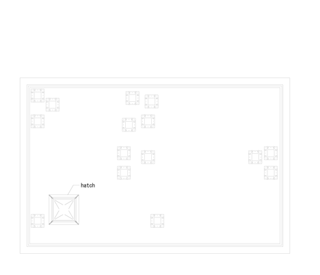
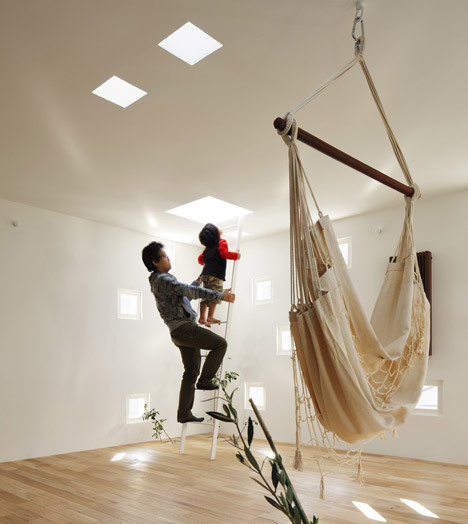
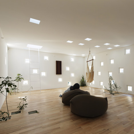
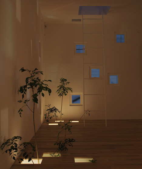
From here, a ladder leads up though a skylight hatch to a terrace on the roof.
Room Room by Takeshi Hosaka
We’ve featured a few projects by Takeshi Hosaka on Dezeen, including a noodle restaurant resembling an igloosee all the stories here.
Room Room by Takeshi Hosaka
Photography is by Koji Fujii / Nacasa & Partners
Room Room by Takeshi Hosaka
Here’s a project description from Hosaka:

RoomRoom (House for hearing Handicapped persons)
This is a house where deaf parents and two children are living.
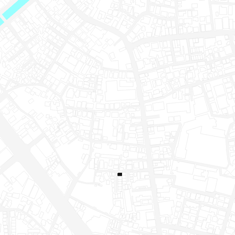
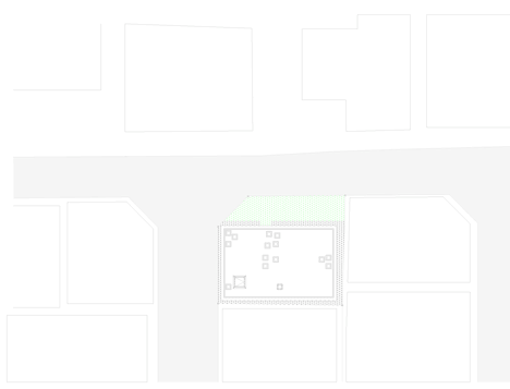
The two sides of the premises are facing narrow roads in an overcrowded residential area in Itabashi ward, Tokyo.
Room Room by Takeshi Hosaka
The small main building built five years ago became so narrow for dwellers for three generations that they bought a piece of land neighbouring their house to build an annex.
Room Room by Takeshi Hosaka
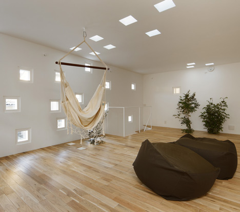
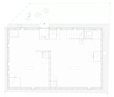
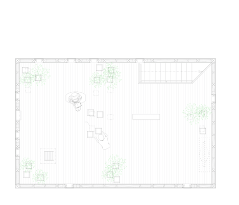
The house consists of two small rooms at the first floor, one big room in the second floor and the roof.
Room Room by Takeshi Hosaka
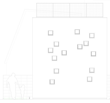
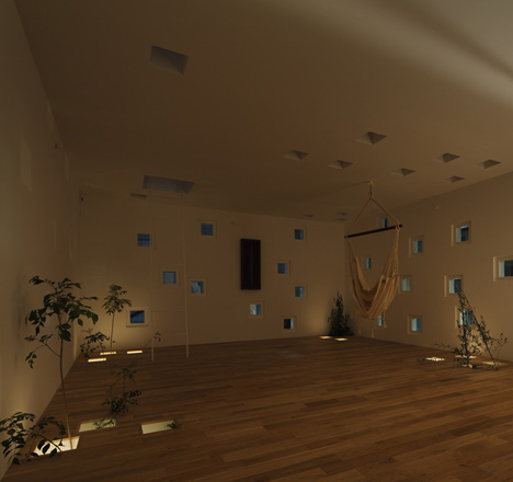
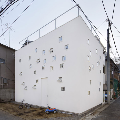
It is two stories with box shape construction with many small openings only 200 mm squares randomly installed on the walls, floors and the roof.
Room Room by Takeshi Hosaka
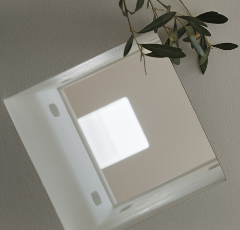
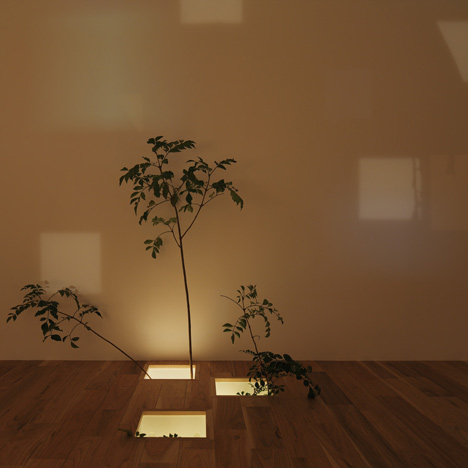
The openings of 200 mm square on the floor are used as atriums or as practical openings for communications between the first and the second floors.
Room Room by Takeshi Hosaka
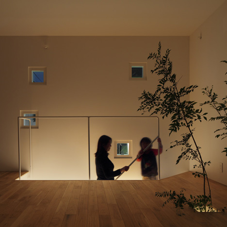
Communications are done through this small opening verbally between children with hearing capability and communications between parents without hearing capability and children with hearing capability are done by sign language.
Room Room by Takeshi Hosaka
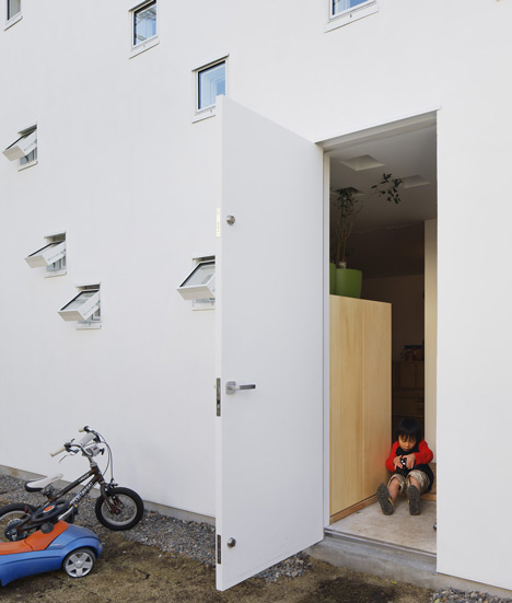
Children sometimes call their parents’ attention by dropping a small minicar.
Room Room by Takeshi Hosaka
The openings on the walls are useful to take air and light from outside and in addition, they are used as a communication tool between a small garden and indoor.
Room Room by Takeshi Hosaka
In the same way, the openings between the rooftop and the second floor and between the rooftop and the first floor not only work to take light from outside but also help communication of sign language.
Room Room by Takeshi Hosaka
And also, the tree set up in the first floor is sticking out to the second floor passing through four or five 200 mm square openings. From this, the 200 mm openings become a conduit for human beings, plant, wind and light and human being communications to extend the inside and outside of the house in length and breadth in all directions.
Room Room by Takeshi Hosaka
It is possible to converse with sign language if we don’t have hearing capability.
Room Room by Takeshi Hosaka
Communications by sign language easily pierce through the window which separates the inside and the outside of the house.
Room Room by Takeshi Hosaka
The small 200 mm square openings are installed at various places like the floor, roof, and wall and children with hearing capability, parents without hearing capability look very free and vivid and plants, light and wind are dynamically circulating from inside to outside.
Room Room by Takeshi Hosaka
Architect: Takeshi Hosaka
Structural Engineers: Nobuo Sakane
Client: Jyunichi Oshiro
Room Room by Takeshi Hosaka
Name of the project: RoomRoom
Exact definition of the building: a couple and two boys
Room Room by Takeshi Hosaka
Location of the project: Itabashi-ku, Tokyo, Japan
Room Room by Takeshi Hosaka
Construction nature: wooden-structure
Room Room by Takeshi Hosaka
Site: 58.43 m2
Room Room by Takeshi Hosaka
Click above for larger image
Building area: 36.00 m2
Room Room by Takeshi Hosaka
Click above for larger image
Floor area ratio: 72.00 m2
Room Room by Takeshi Hosaka
Click above for larger image
Building height: 5450 mm
Room Room by Takeshi Hosaka
Click above for larger image
No. of floors: 2F
Room Room by Takeshi Hosaka
Click above for larger image
Building function: house (annex)
Room Room by Takeshi Hosaka
Design: May 2010 – September 2010
Room Room by Takeshi Hosaka
Planning start: May 2010
Room Room by Takeshi Hosaka
Beginning of construction: September 2010
Room Room by Takeshi Hosaka
Completion: December 2010
PROJECT DB te Nazareth by Min-interieurarchitectuur

Tomorrow we're off for two months te Nazareth (Belgium).
Total makeover of a home including an extension.
Follow the progress!!

Bijschrift toevoegen


dinsdag 27 september 2011

postmodernism: style and subversion 1970-1990

Postmodernism Style and Subversion
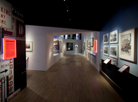
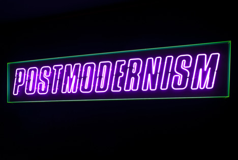
London Design Festival 2011: divisive designs from the 1970s and 1980s are brought together in a retrospective exhibition entitled Postmodernism: Style and Subversion 1970-1990, which opened at the Victoria & Albert museum at the weekend.
dezeen_Postmodernism Style and Subversion_14
The exhibition examines the radical ideas that defined the movement and its relationship with popular culture and mass consumption.
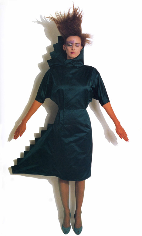
All images copyright V&A images unless otherwise stated.Top image: copyright Jean-Paul Goude
dezeen_Postmodernism Style and Subversion_01
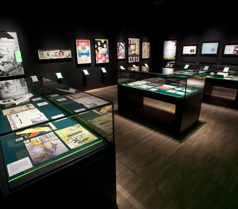
Over 250 objects are being exhibited from the archives of renowned architects and designers including Philip Johnson, Aldo Rossi, Memphis, Studio Alchymia and Neville Brody.
dezeen_Postmodernism Style and Subversion_02
Above image: Private Collection
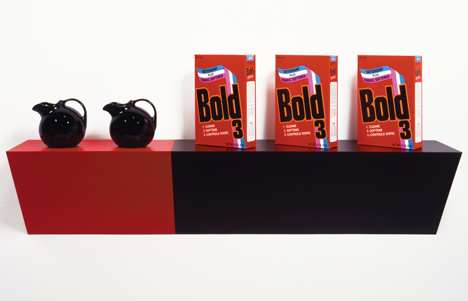
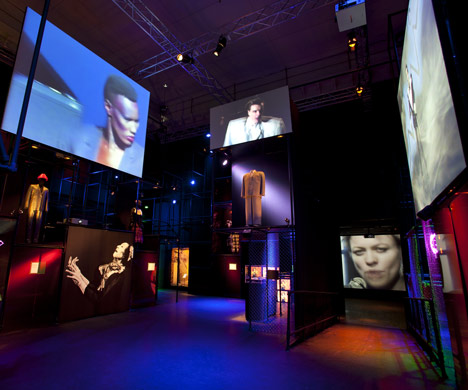
Also on show are artworks by Robert Rauschenberg, Andy Warhol and Jeff Koons and music videos featuring New Order and Grace Jones.
Postmodernism Style and Subversion
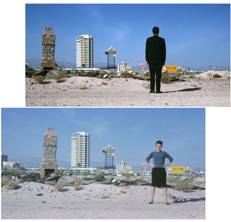
Above image: copyright Venturi, Scott Brown and Associates
See responses to the postmodern revival in our Dezeen Wire stories including Rowan Moore in The Observer, Alice Rawsthorn in The New York Times and Justin McGuirk in The Guardian.
Postmodernism Style and Subversion
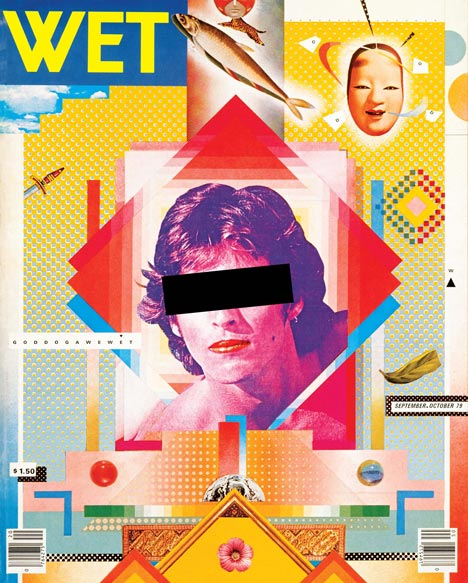
Above image: copyright April Greiman and Jayme Odgers
Postmodernism: Style and Subversion 1970-1990 runs until 15 January 2012.
Postmodernism Style and Subversion
Above image: copyright Peter Saville
See all our stories about the London Design Festival here and all of our V&A stories here.
Here are some more details from the V&A:

Postmodernism: Style and Subversion 1970 – 1990
Supported by the Friends of the V&A With further support from Barclays Wealth 24 September 2011 – 15 January 2012
Postmodernism Style and Subversion
The V&A’s major autumn exhibition is the first in-depth survey of art, design and architecture of the 1970s and 1980s, examining one of the most contentious phenomena in recent art and design history: Postmodernism. It shows how postmodernism evolved from a provocative architectural movement in the early 1970s and rapidly went on to influence all areas of popular culture including art, film, music, graphics and fashion.
Postmodernism Style and Subversion
The exhibition explores the radical ideas that challenged the orthodoxies of Modernism; overthrowing purity and simplicity in favour of exuberant colour, bold patterns, artificial looking surfaces, historical quotation, parody and wit, and above all, a newfound freedom in design. Many modernists considered style to be a mere sideshow to their utopian visions; but for the postmodernists, style was everything.
Postmodernism Style and Subversion
Postmodernism: Style and Subversion 1970 – 1990 brings together over 250 objects across all genres of art and design, revisiting a time when style was not just a ‘look’ but became an attitude.
Postmodernism Style and Subversion
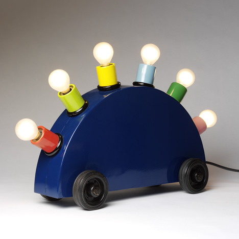
On display are the subversive designs of the Italian collectives Studio Alchymia and Memphis; graphics by Peter Saville and Neville Brody; architectural models and renderings including the original presentation drawing for Philip Johnson’s AT&T building (1978); paintings by Robert Rauschenberg and Andy Warhol; Jeff Koons’ stainless steel bust of Louis XIV (1986); performance costumes including David Byrne’s big suit from the documentary Stop Making Sense (1984); excerpts from films such as Derek Jarman’s The Last of England (1987); and music videos featuring Laurie Anderson, Grace Jones and New Order.
Postmodernism Style and Subversion
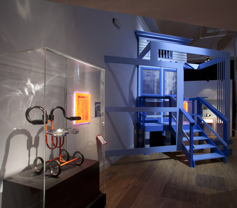
Professor Martin Roth, Director of the V&A, said: “It feels right to hold this exhibition now, 40 years on from when the first ideas of what we now know as Postmodernism emerged. Many of our visitors will have personal recollections of the time and can reflect on the impact of Postmodernism on their lives as well as on the wider design culture and practice. There are so many layers to the subject that we hope that the younger generation will be interested to discover more about this dramatic period of art and design history, and its lasting impact. “The exhibition is arranged in three broadly chronological sections identifying the key aspects of postmodernism. The first gallery focuses largely on architecture, the discipline in which the ideas of postmodernism first emerged. It shows how ‘high’ and ‘low’ cultural references were blended into a new critical language, which was aimed both at the inadequacies of Modernism and the alienating conditions of late capitalism. This opening section also introduces the way in which postmodern designers and architects like Aldo Rossi, Charles Moore and James Stirling combined motifs of the past with elements of the present. Designers of the time, including Ron Arad, Vivienne Westwood and Rei Kawakubo, assembled cultural fragments in an ‘ad hoc’ manner, applying the technique of bricolage across many different disciplines. The centrepiece of the gallery is a full-scale reconstruction of an architectural façade by Hans Hollein from the 1980 Venice Architecture Biennale.
Postmodernism Style and Subversion
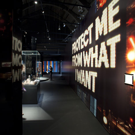
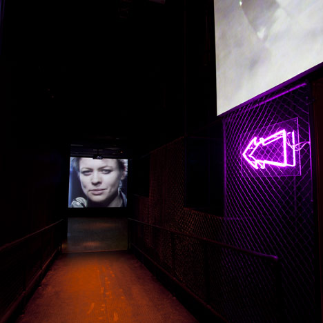
The second part of the exhibition is devoted to the proliferation of postmodernism through design, art, music, fashion, performance, and club culture during the 1980s. Performers such as Grace Jones, Leigh Bowery and Klaus Nomi played with genre and gender, creating hybrid, subversive stage personas. Like the music, objects and architecture of the time, these celebrities were themselves constructed from ‘samples’. This section of the exhibition is saturated with audio-visual installations, creating a dynamic club-like space to display objects including fashion photography by Guy Bourdin and Helmut Newton, stage ensembles worn by Annie Lennox and Devo, turntables used by hip-hop pioneer Grandmaster Flash, and dance costumes related to the choreography of Karole Armitage, Kazuo Ohno, and Michael Clark.
Postmodernism Style and Subversion
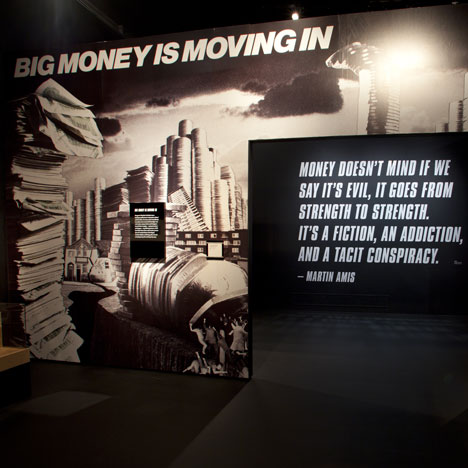
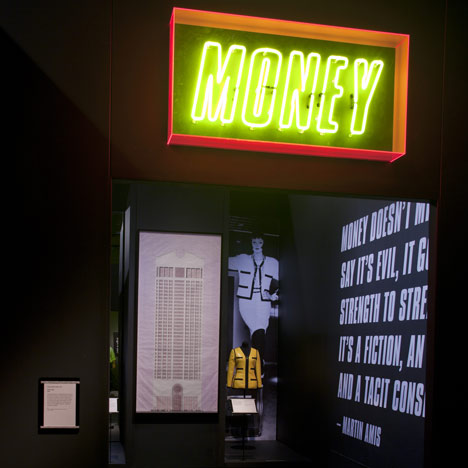
The final section examines the hyper-inflated commodity culture of the 1980s. This boom decade saw money become a source of endless fascination for artists, designers and authors. From Andy Warhol’s 1981 Dollar Sign paintings, to Karl Lagerfeld’s designs for Chanel, consumerism and excess were trademarks of the postmodern. Brands including Swatch, MTV and Disney were also keen to employ leading designers to apply postmodern style to their products; one example on display will be a Mickey Mouse tea set designed by Michael Graves for Disney. As the novelist Martin Amis put it in 1984, ‘money doesn’t mind if we say it’s evil, it goes from strength to strength.’
Postmodernism Style and Subversion
By the late 1980s, many had started to declare the death of postmodernism – without being quite sure what would take its place. The exhibition concludes with art and design from this uncertain moment, encouraging visitors to consider what relevance the postmodern episode might have for the present day.
Postmodernism Style and Subversion
Postmodernism: Style and Subversion 1970 – 1990 is curated by Glenn Adamson and Jane Pavitt
The exhibition takes place at the V&A from 24 September 2011 – 15 January 2012
Postmodernism Style and Subversion